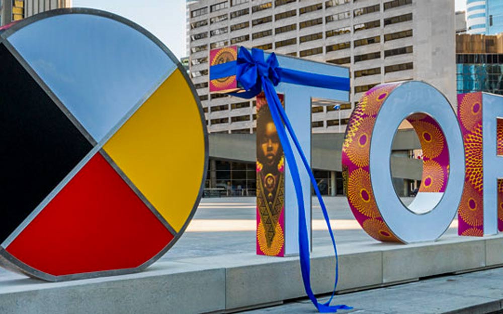
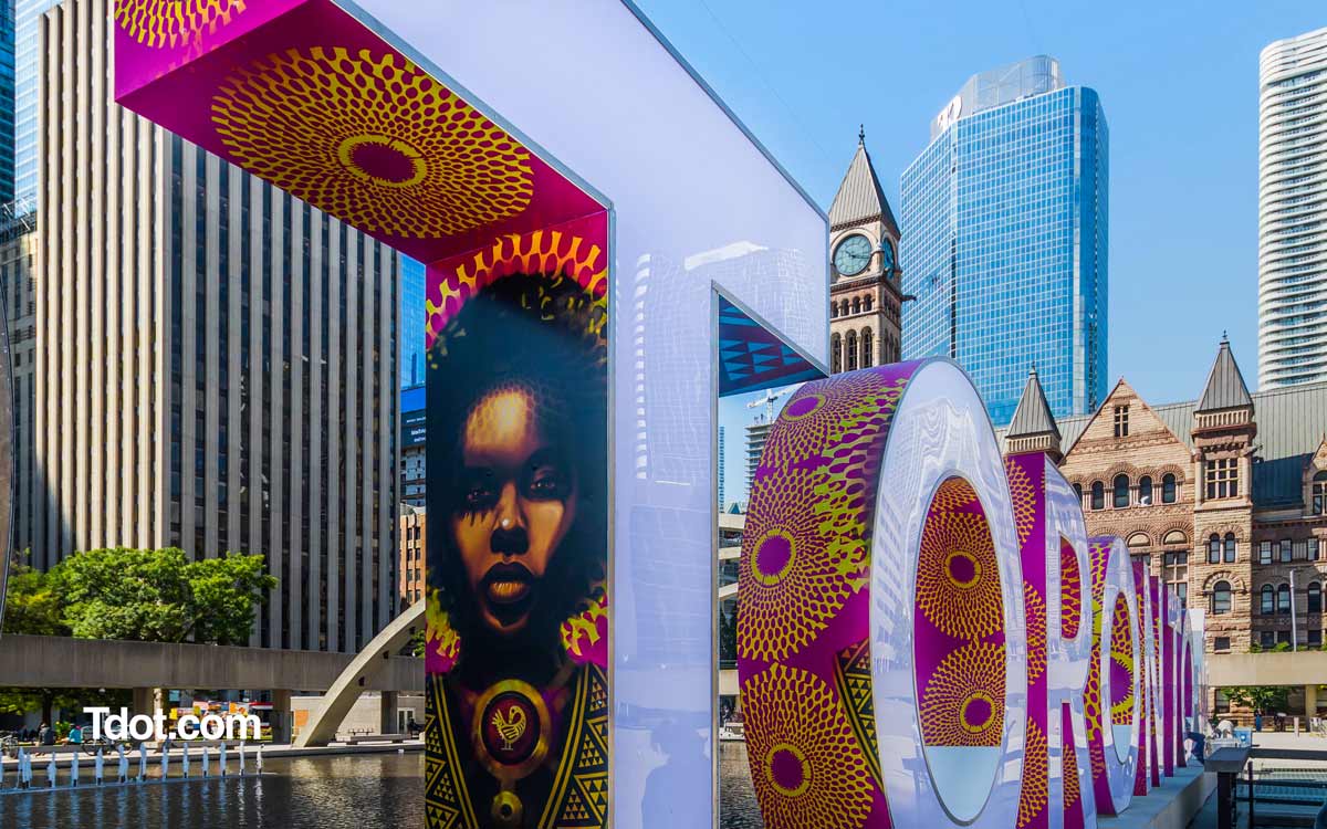
How do you feel about the new Toronto sign? Some seem to like it. Some seem to hate it. Does the TO sign really need themed visual art layered on via a wrap? If so… What comes next?
Read on and let us know what you think. Comment on our Instagram post.
Photography by @mw_city_photography
The Toronto sign is a highly photographed landmark and cultural touchstone. Who knew it would provoke controversy when a new version appeared with a People of African descent-themed wrap. Most people seem to like it and I think it’s timely and appropriate – but not everyone feels the same. We looked at the issue and provide you with some context and insight.
Last week the City of Toronto put in a new sign, replacing the sign originally installed in July 2015 for the Toronto 2015 Pan American / Parapan American Games. The wrap was designed by Toronto artist Danilo Deluxo McCallum, to honour the United Nations International Decade for People of African Descent. According to the city “The artwork is part of ArtworxTO: Toronto’s Year of Public Art 2021.”
How do we all feel about this art and signage? I have mixed feeling about it, mostly because I though I like the art I am not sure I like “art on my Toronto sign.” And it is my sign. And yours. It’s all of ours really. Does this sign need art on it?
I wanted to shout out the amazing photographer @mw_city_photography who contributed these shots. I love these pics. Look at the detail with the person wearing a BLM / Black Lives Matter hoodie. It’s perfect. Yet there’s something about the scene that doesn’t quite work for me. Maybe the sides of the sign would look better “unwrapped?”
As some will know the famous sign already had one significant upgrade, after the Pan Am Games in 2015. First came the installation of the Maple Leaf in 2016 and the Medicine Wheel First Nations’ Medicine Wheel symbol was done in 2018 which brought two cultural additions to the sign.
In essence the sign is now comprised of 4 parts:
- T-O-R-O-N-T-O letters
- Maple Leaf
- First Nations’ medicine wheel
- Wrap (currently black culture theme)
A Short History of the Toronto Sign Wrap
The wrap has had many incarnations and should change on a yearly basis, though we understand the aboriginal iconography lasted a period of two years. According to the City of Toronto new release: “One of the design features of the Toronto Sign is a vinyl wrap on the outer edges of its letters. The wrap is refreshed approximately every 12 months. The design of the Toronto Sign wrap is used to promote events, projects and City priorities. Themes for past Toronto Sign wraps have included: Pan Am and Parapan Am Games, Nuit Blanche Toronto artist installation by JR, Toronto Neighbourhoods, Canada 150, My City My Six Exhibition, and Indigenous Iconography.”
There are a few controversies surrounding the new version of the TO sign – from costs to culture – but we think the cultural commentary is mostly worth our time and consideration.

It’s worth noting that lost amid the clatter is that this is a WRAP. The nature of wraps, as anyone who pays attention to signage in transit stations would know, is that they can change regularly, and often do. In other words it’s temporary, whether that’s weeks, months or a year or more.
This version costs a whopping $750,000. While a significant sum we expect outdoor signage and the work of designers and installers and fabricators could easily get us a product at least in the mid six figures. So this sum is not so surprising. A million bucks doesn’t get you much these days does it?
The part we find thought provoking is the cultural aspect of the visual of the sign. Keeping with the vibe of 2020 and Black Lives Matter protests, the city decided to employ a Black / African cultural theme. It’s been popular. However some folks didn’t like this.
On social media we found posts like this one at @inside_to
Here’s a sampling of the comments:
“The designs looks mesmerizing” / “Great Art” / “No Italians no Greeks no Tamils no natives I thought Toronto was a diverse city” / “Weak minded politicians ……Toronto is made up of 100+ races and numerous sexual identities” / “What would Rob Ford do?”
Let’s overlook the fact that few people seem to know about the significance of the First Nations medicine wheel. That last comment is truly the best isn’t it? What would Rob Ford do? Hmmm.
But let’s get down to a sensible discussion shall we?
There are two ways to look at this. Is this appropriate for a city artwork?
It’s important the sign represents the city and the times. BLM certainly fits the mood of the moment. Only months ago there were mass protests in Toronto and around the world. There is a connection to the UN declared The International Decade for People of African Descent, which runs from 2015–2024. Lastly this piece is part of the ArtworxTO: Toronto’s Year of Public Art 2021 and according to the artist, the wrap will be up through next year and then is scheduled to change.
OF course it’s key to emphasize that the art element is a wrap, which is a temporary decorative element. There will be a future iteration. Perhaps for a future Nuite blanche or festival in the city the wrap will take on a different theme? We are curious to know how that process will work.
Will we cry out if the next wrap is for Pride 20201? Will the public demand the next cultural version be for the “multiculture” or even “European culture?”
Speaking personally, growing up in Canada since the 1970s I grew accustomed to the way Canadian politics celebrates identity and diversity, welcoming refugees, new immigrants and difference in general.
I know my ancestors would love to see a Scots built Canada wrap that would celebrate the achievements of Scots whether the children who came as virtual slaves to work on farms or those who arrived as industrial barons. But the founding cultures are not often celebrated in this kind of public way, which may be a shame, but understandable since campaigns to revoke the names of institutions named for historic figures from the UK gathered steam this year as well.
I think the best solution is to simply let the signs be what they were – a colourful display with solids or gradients that can be programmed to emit a wonderful simplified visual. In other words, let the new sign be the newly improved old sign. A 3D sculpture with a cool LED light display at night. Simple but effective.
If you have to wrap it – wraps should be made inexpensively and go up for the duration of periods relating to festivals or anniversaries important to the city: Pride or Caribana in summer, TIFF in fall, the city’s birthday, the 200th anniversary of the founding of the U of T (coming in 2027). You get the idea. It can be an ever-evolving mosaic that lasts short periods and covers all people and events that are relevant to this city.
And that doesn’t have to be controversial at all. Does it?
_ _
If you are inclined to comment check out this post on IG, FB, Twitter
Thank you for reading and thinking
We have reached out to the City of Toronto for comment on the process to select the future themes and artists for the wraps. We will update this when we know.

